Latex Bustier, around 297 x 420 mm, 2014.
Friday, 2 May 2014
Thursday, 1 May 2014
Drawing Studio Practice
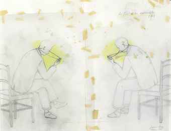
When I think of certain people certain objects appear into my mind. Objects that either resemble them, they often use or fit their personality. So I decided to explore this. My Project is based on people in my life that I associate with objects.
For Research I firstly drew objects that I affiliate with people such as bottles, scissors, microphones etc.. Then I sketched from life and from photographs the people in my life that I associate objects with. I did these drawings in a linear style like that of David Hockney and slightly more detailed drawings like that of David Epstein.
Developing my work I tried different ways of combining the objects and people together to demonstrate that they were connected. At first I drew the objects directly onto the portraits of people however I felt that the extent of lines made it too harsh. So I experimented with using tracing paper, inspired by the work of Francis Alys, and acetate. Furthermore I drew the people on the real life physical objects that I associated them with, though I realised later that this was not worth pursuing as some objects would be incredibly hard to draw on top of.
So I revisited the idea of drawing objects on top of the portraits of people and found that some of the facial features fit inside the object as a sort of frame. So I drew a partial portrait in the composition of the object that I associated them with. I found that doing this in a line drawing lacked depth so I pursued the drawing in a more detailed way like that of Jacob Epstein. This is what I did for my final piece.
Sculpture Studio Practice
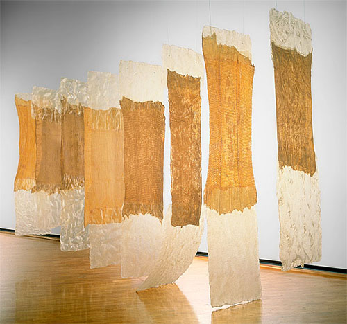
Eva Hesse
Researching the work of Eva Hesse I came across her latex work which looks like hanging skin. Therefore this inspired me to use latex as my primary material due to it's clear and flesh like qualities. Furthermore latex is used in costuming to create fake skin.
I looked at my cuts and bruises and experimented with covering these with latex. I did this by photographing the cuts and bruises on my body and face covered by small bits of latex and without. I also tried creating a cast of my arm in plaster and covering the scars by pouring latex on top of it. Furthermore I attempted to create an arm out of latex, a thin layer to go on top of my skin. However I ended up pouring the latex too thick as it was hard to cast due to the runny nature of latex. I also looked at stitches. Sewing latex together to look like stitches.
Researching skin cells I decided to create a sort of second skin armour out of latex in the sort of shape of skin cells as it covers my blemishes in patches in which they form. Inspired by chain-mail, the way it interlinks I decided to interlink little pieces of latex.
I tried to fix it together in the manner of stitches by sewing them individually together however this took too much time so I used glue.
Inspired by Franc Fernandez' meat dress for my final piece I will have created a garment out of latex that will look much like this.

Franc Fernandez
Jacob Epstein
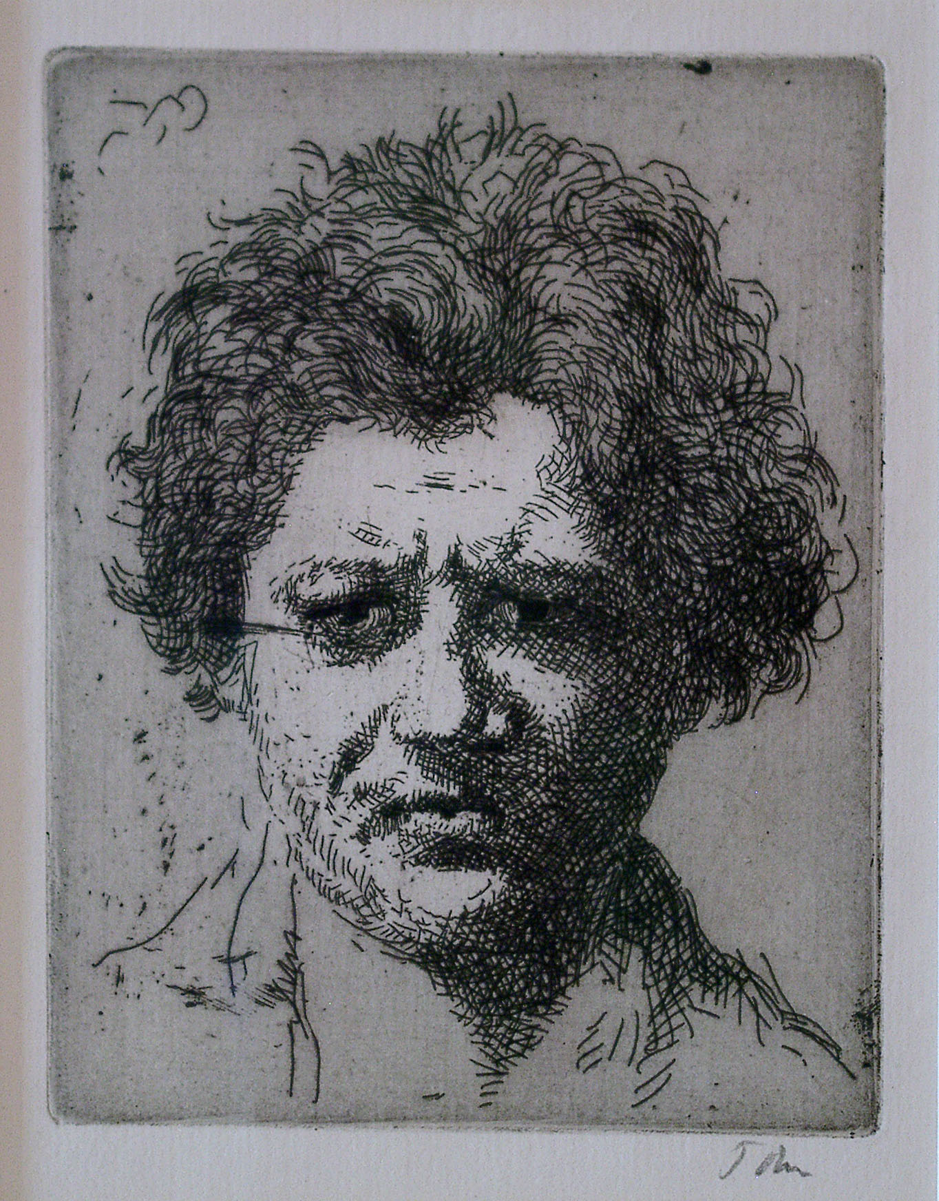
Jacob Epstein was born in America on 10th November 1880 and died in August 1959. He moved to Europe in 1902 and became a British citizen in 1911. Primarily known as a sculptor he often produced controversial works which challenged taboos on what appropriate subject matter was for public artworks.
However I have been influenced by Epstein's portrait drawings which are simple without lots of exaggerated shading and detail yet still retain realism.
Wednesday, 30 April 2014
David Hockney

David Hockney is an English painter, draughtsman, printmaker, stage designer and photographer. He was born on the 9th July 1937.
He is considered one of the most influential British Artists of the 20th century.
He was an important contributor to the Pop Art movement of the 1960's. Pop Art employs aspects of mass culture such as advertising, comic books and mundane cultural objects. It is widely interpreted as a reaction to the then-dominant ideas of abstract expressionism as well as an expansion upon them. It is also similar to the Dada movement through its similar use of images and found objects. The Pop Art movement also utilises irony a lot.
I however have been influenced by Hockney's line drawing portraits. I like the way that they are simple as they are without colour and shading. I have tried to emulate this in my work.
Evidence Document
A review of my Chuck Close Presentation
The main criticism of my Chuck Close Presentation by my peers and tutor was that it was too short. I stuck to the essential information meaning the presentation was around 7 minutes long instead of around 10-15 with questions. Information I should have included was what photorealism was about, who Chuck Close was influenced by and a review by a critic about Chuck Close's work. I f I did my presentation again what I would have added to it is shown here in red:
Charles Thomas Close (Chuck Close) is an American contemporary artist.
He is strongly associated with the photorealist movement of the 60’s and 70’s along with artists such as Richard Estes and Audrey Flack.The photorealist movement evolved from Pop Art and was a reaction to Abstract Expressionism and the Minimalism art movements.The photorealist movements’ intentions were to create artwork that was true to life. They achieved this by working from photographs rather than from life.
However Chuck Close does not like the word photorealism being associated with his work as he is ‘as interested in the artificial as he is the real and it is really the tension between, a ripping back and forth, the distribution of the flat marks on the surface of a painting,’ he’s made by rubbing coloured dirt, with a stick with hairs glued on the end of it all over some cloth wrapped over some sticks, it’s a highly artificial activity making a painting and their made by hand slowly piece by piece, not a way a photograph is made or an image on a computer screen. When viewers are confronted with one of his huge painting and they are looking at it they are seeing the journey that he took to build the image.
Chuck Close was influenced by the work of Jackson Pollock which he saw as a child. This work was what influenced him to become an artist. He describes his encounter like this "I went to the Seattle Art Museum with my mother for the first time when I was 11. I saw this Jackson Pollock drip painting with aluminum paint, tar, gravel and all that stuff. I was absolutely outraged, disturbed. It was so far removed from what I thought art was. However, within 2 or 3 days, I was dripping paint all over my old paintings. In a way I've been chasing that experience ever since." Another artist that had inspired him was William de Kooning and he emulated his work during much of his education. However he turned his back on abstract expressionism as he wanted to find his own style.
At the start of his career he paints extremely true to life to show off his artistic skill and establish him as an artist. He creates such realism in his work by his grid technique. He takes the photo of the subject he is going to paint and splits it into a grid and then draws out a larger corresponding grid on a canvas, this ensures everything will be in proportion and therefore true to life. Furthermore his work is made realistic through the use of shading in his painting to give the illusion of three dimensions rather than being a flat shape. You can see clearly on the skin the use of different tones and colours to create shadows and highlights which makes the skin look round and flesh like. Later in his career in the 60’s and 70’s he begins to experiment with colour, different media and techniques.
He begins to move away from photorealism and start to create the pixelated realistic images that he produces today. He further develops this after the accident and the colours and shapes used to create the portrait are looser.
I have chosen to look at one of Close’s most recent pieces of work, Self Portrait (Yellow Raincoat), 2013.
Close never works at a small scale, this piece is 190.5 x 152.4 cm and he once said himself that, ‘If you paint a face big enough, it’s hard to ignore.’ This work is a kind of computer aided watercolour. Close selected and arranged swatches of watercolour squares from over 14,000 he hand painted separately. The finished works are printed on watercolour paper with watercolour paint in several layers of cyan, magenta & yellow. This building up of an image from separate images gives it this pixelated photo effect. The subject matter is him and is has a simple composition a frontal head and shoulders. It has a blue background. It is composed like a passport photo expressionless and unforgiving, with wrinkles and age spots.
Most of Chuck Close’s artworks are like this, people in passport like poses. This is because he has Prosopagnosia, face blindness, and creating a flat image of a person helps him recognise a person. He therefore only creates artworks about people of importance to him; friends, family, other artists. His condition is also crucial to the way he creates his artwork; he breaks the face down into units by using a grid and builds up the painting from these units. Close says, ‘my subjects are not people. I paint portraits of photographs.’ This makes the viewer not focus on the subject matter but on how the portrait is made, because of this grid technique they see it as Chuck Close does a build-up of painted shapes rather than a whole photorealistic portrait.
His artwork has changed over time naturally as all artists develop their work however Chuck Close’s artwork changes for a different reason. He suffered from a seizure in 1988 that forced him into a wheelchair and meant he had to relearn how to do a lot of things, including paint. He now paints with a paintbrush strapped to his wrist.
A review of 'Chuck Close: Recent Works' at Guild Hall Museum by the New York times argues against this however saying that his work has matured over time rather than being affected by his illness 'when you think of the “pugnaciously punk” young artist of the “Big Self-Portrait,” a persona Mr. Finch compares to the “urbane, successful New Yorker” in the self-portraits here, you see changes that probably have less to do with “the Event” and more to do with time and maturity. Change is not the hallmark of Mr. Close’s oeuvre, but this show demonstrates how, as with Piet Mondrian or Robert Ryman or Cindy Sherman — or any artist generally following a single path over the course of his or her career — shifts occur. For Mr. Close, these have to do with the relationship between photography and painting, but also with the way that digital media have altered our perceptions of time and the image — and ourselves.'
In conclusion if you compare Chuck Close with his work, you can see that both of them have gone through quite an impressive journey.
However some good points about my presentation is that my images were large, clear and correctly labelled with enough to engage the audience but not so many as to confuse them. I also spoke clearly and loudly.
Tuesday, 29 April 2014
Self Directed Statement
As someone with a lot of cuts, scars and bruises I have the desire for new skin. Skin that would cover the blemishes, protect and be like an armour. My project is based on this.
Researching the work of Eva Hesse I came across her latex work which looks like hanging skin. Therefore this inspired me to use latex as my primary material due to it's clear and flesh like qualities. Furthermore latex is used in costuming to create fake skin.
I looked at my cuts and bruises and experimented with covering these with latex. I did this by photographing the cuts and bruises on my body and face covered by small bits of latex and without. I also tried creating a cast of my arm in plaster and covering the scars by pouring latex on top of it. Furthermore I attempted to create an arm out of latex, a thin layer to go on top of my skin. However I ended up pouring the latex too thick as it was hard to cast due to the runny nature of latex. I also looked at stitches. Sewing latex together to look like stitches.
Researching skin cells I decided to create a sort of second skin armour out of latex in the sort of shape of skin cells as it covers my blemishes in patches in which they form. Inspired by chain-mail, the way it interlinks I decided to interlink little pieces of latex. I tried to fix it together in the manner of stitches by sewing them individually together however this took too much time so I used glue. This is my final piece a garment constructed by glueing tiny pieces of latex together inspired by the design of Franc Fernandez's famous Meat dress.
Monday, 21 April 2014
Drawing Statement
When I think of certain people certain objects appear into my mind. Objects that either resemble them, they often use or fit their personality. So I decided to explore this. My Project is based on people in my life that I associate with objects.
For Research I firstly drew objects that I affiliate with people such as bottles, scissors, microphones etc.. Then I sketched from life and from photographs the people in my life that I associate objects with. I did these drawings in a linear style like that of David Hockney and slightly more detailed drawings like that of David Epstein.
Developing my work I tried different ways of combining the objects and people together to demonstrate that they were connected. At first I drew the objects directly onto the portraits of people however I felt that the extent of lines made it too harsh. So I experimented with using tracing paper, inspired by the work of Francis Alys, and acetate. Furthermore I drew the people on the real life physical objects that I associated them with, though I realised later that this was not worth pursuing as some objects would be incredibly hard to draw on top of.
So I revisited the idea of drawing objects on top of the portraits of people and found that some of the facial features fit inside the object as a sort of frame. So I drew a partial portrait in the composition of the object that I associated them with. I found that doing this in a line drawing lacked depth so I pursued the drawing in a more detailed way like that of Jacob Epstein. This is what I did for my final piece.
Saturday, 12 April 2014
Franc Fernandez
Franc Fernandez is a Los Angeles based designer, artist and creative director. He was born in Argentina but then moved with his family to LA. Fernandez attended Art Center College of Design, architecture and art school but dropped out of all three. He apprenticed for a milliner in London.
He first started experimenting with clothing at school combining shirts and sweaters and sewing their labels on the outside. It was his hats that really took off and he began to receive requests from stylists for custom pieces. His career took off when he was contacted by Nicola Formichetti. France Fernandez has worked was many musicians, such as Lady Gaga and Beyonce. He did the styling for the Scissor Sisters' UK arena tour. Furthermore he directed the music video for Sam Sparro's "Pink Cloud",
He first started experimenting with clothing at school combining shirts and sweaters and sewing their labels on the outside. It was his hats that really took off and he began to receive requests from stylists for custom pieces. His career took off when he was contacted by Nicola Formichetti. France Fernandez has worked was many musicians, such as Lady Gaga and Beyonce. He did the styling for the Scissor Sisters' UK arena tour. Furthermore he directed the music video for Sam Sparro's "Pink Cloud",
Friday, 11 April 2014
A comparison between Will Barnet and Henri Matisse
In a way Matisse and Barnet’s works are quite similar. Both artworks are pretty flat due to lack of perspective or lack of it. Though Matisse’s looks more realistic with some shading making the woman look more rounded. They both have similar colour schemes with the colours, red white, brown and blue being prevalent.
Furthermore they both feature similar subject matters; women reclining. The Odalisque in Matisse’s painting reclines on a red chaise langue. The woman in Barnet’s work reclines in bed. These females also both feature in the titles of these works.
However Matisse’s woman seems more of an object rather than a subject of the painting. This is due to several features including; composition, the paint and the name of the painting itself. The composition of the painting is such that the focal point of the piece is the small coffee table. The woman seems pushed to the side as she is of less importance. The way the piece is painted also contributes to the objectification of the woman, the fact that she is wearing similar colours to that of the background and the foreground means she blends in.
The name of the piece hints that the woman is the subject matter however the term used and the description of her is very dismissive, ‘Odalisque in Red Trousers.’ An Odalisque is a female slave or concubine in a Turkish harem. Although by the eighteenth century the term odalisque referred to the eroticized artistic genre in which normally an eastern woman lied on her side and displayed for the spectator. The woman in Matisse’s work was not a concubine; it was most likely Henriette Darricarrière who frequently modeled for Matisse. The fact she is described as wearing red trousers in the title instead of what she is doing shows that she is in the painting purely for decorative purposes.
Therefore the woman in Matisse’s work is definitely not the subject of the painting Matisse is just trying to recreate the rich exotic scenes he saw in Morocco with brightly coloured richly patterned fabrics and oriental rugs and capture this on canvas.
Contrastingly the woman featured in Barnet’s piece is definitely the subject. Compositionally she is central and the main feature of the painting. Although it could be argued that the cat is the main focus of the work as it stares out of the picture creating eye contact with the viewer and it’s head is at the centre of the picture. However its ears point upwards towards the woman’s face and the book she is holding creates a frame making her the focal point of the piece. Additionally her obvious ownership of the cat contributes to her being the subject of the artwork. Furthermore this artwork is named after what she is doing, ‘Woman Reading,’ making it clear that she is the subject and the focus on what she is doing , holding a book, rather than what she is wearing.
Henri Matisse, Odalisque in Red Trousers, c.1924-1925, Oil on canvas, 50.0 x 61.0cm
Woman Reading by Will Barnet, 1965, Unknown size and media.
Chuck Close Presentation

Charles Thomas Close (Chuck Close) is an American contemporary artist.

He is strongly associated with the photorealist movement of the 60’s and 70’s along with artists such as Richard Estes and Audrey Flack. The photorealist movements’ intentions were to create artwork that was true to life. They achieved this by working from photographs rather than from life.
However Chuck Close does not like the word photorealism being associated with his work as he is ‘as interested in the artificial as he is the real and it is really the tension between, a ripping back and forth, the distribution of the flat marks on the surface of a painting,’ he’s made by rubbing coloured dirt, with a stick with hairs glued on the end of it all over some cloth wrapped over some sticks, it’s a highly artificial activity making a painting and their made by hand slowly piece by piece, not a way a photograph is made or an image on a computer screen. When viewers are confronted with one of his huge painting and they are looking at it they are seeing the journey that he took to build the image.


I have chosen to look at one of Close’s most recent pieces of work, Self Portrait (Yellow Raincoat), 2013.

Close never works at a small scale, this piece is 190.5 x 152.4 cm and he once said himself that, ‘If you paint a face big enough, it’s hard to ignore.’ This work is a kind of computer aided watercolour. Close selected and arranged swatches of watercolour squares from over 14,000 he hand painted separately. The finished works are printed on watercolour paper with watercolour paint in several layers of cyan, magenta & yellow. This building up of an image from separate images gives it this pixelated photo effect. The subject matter is him and is has a simple composition a frontal head and shoulders. It has a blue background. It is composed like a passport photo expressionless and unforgiving, with wrinkles and age spots.
Most of Chuck Close’s artworks are like this, people in passport like poses. This is because he has Prosopagnosia, face blindness, and creating a flat image of a person helps him recognise a person. He therefore only creates artworks about people of importance to him; friends, family, other artists. His condition is also crucial to the way he creates his artwork; he breaks the face down into units by using a grid and builds up the painting from these units. Close says, ‘my subjects are not people. I paint portraits of photographs.’ This makes the viewer not focus on the subject matter but on how the portrait is made, because of this grid technique they see it as Chuck Close does a build-up of painted shapes rather than a whole photorealistic portrait.
His artwork has changed over time naturally as all artists develop their work however Chuck Close’s artwork changes for a different reason. He suffered from a seizure in 1988 that forced him into a wheelchair and meant he had to relearn how to do a lot of things, including paint. He now paints with a paintbrush strapped to his wrist.
In conclusion if you compare Chuck Close with his work, you can see that both of them have gone through quite an impressive journey.
Wednesday, 12 February 2014
Francis Alÿs
Francis Alÿs was born in Belgium in 1959. He studied architectural history at the Institute of Architecture in Tournai and engineering in Venice before relocating to Mexico city in 1986 originally arriving as part of a French assistance program after an earthquake. This is where he now lives and works as a practicing artist.
His work mainly involves looking at the cultural and economic conditions of particular places, usually conceived during walks of urban areas. He is widely known for his documentary style projects addressing economic and social injustice in Latin America.
However his drawings on tracing paper is what has influenced my artwork.
Wednesday, 15 January 2014
Sculpture Project: Light and Made
In sculpture we were given a list of words to use to create a piece of work from. I chose the words light and made. In the previous session we were asked to bring in our favourite objects, to draw from them and create sculptures from them. I decided to continue on from this and create something based on my favourite object, a mug, featuring aspects of the words light and made.
I wanted to physically make something using my hands out of a light material. At first I tried to create a set of paper-mache mugs however when I attempted this my paper-mache creation just stuck to the mug. To overcome this obstacle I changed my approach and used plaster bandages on the inside of the mug which I covered in clingfilm. Mounting these cups made from plaster bandages on my wall I thought they were a bit plain so inspired by my object I placed teabags within them creating more interest in the piece.
.jpg)
.jpg)
.jpg)
.jpg)

I wanted to physically make something using my hands out of a light material. At first I tried to create a set of paper-mache mugs however when I attempted this my paper-mache creation just stuck to the mug. To overcome this obstacle I changed my approach and used plaster bandages on the inside of the mug which I covered in clingfilm. Mounting these cups made from plaster bandages on my wall I thought they were a bit plain so inspired by my object I placed teabags within them creating more interest in the piece.
Anyone for a cup of tea? 2013, plaster bandages and teabags.
Then we were asked to develop this piece. I found it amusing that my sculpture was based on an object that could hold liquid however my sculpture could not, so I explored that idea. My first idea was to create a tea set from plaster however it became apparent from 'Spoon' that it was impractical due to the amount of clay to produce a mold of a mug and removing said object from the clay.
Spoon, 2013, plaster mold of a spoon.
Then I contemplated how I can adjust a mug so that it can't hold liquid and I arrived at the conclusion to simply smash them and glue them back together in more interesting ways; thus creating, my drinking cup I and II.
My drinking cup, 2013, broken china and glue.
My drinking cup II, 2013, broken china and glue.
However I judged my work as being too plain so I added colour to my project by breaking mugs of different colours and glueing them together mismatched. I also created a video to emphasise how useless these mugs are called, Fill up my cup.
What a smashing cup of tea, 2013, broken china and glue.
Journey Project
My Journey route involved walking to where my friends are. However whilst drawing my journey I found that my drawings were more interesting if I kept walking whist drawing. This gave my work momentum. Then I had the idea of letting my hand go free and just draw the motion of my walking. I explored this using different colours to reflect my mood on my journey, for example red for angry. Furthermore I experimented by drawing on top of photographs of my journey. However I found that filling the page with my journey in just plain black really emphasized that my work was about the movement.
.jpg)
.jpg)


.jpg)
Sculpture Presentation: Post-Minimalism: Eva Hesse
Is a style of art that is simple like minimal art however it strives to imbue works with meaning. Post-minimalist artists attempt to go beyond the mere aesthetic of minimalism. Artworks are usually everyday objects, use simple materials and sometimes take on a 'pure' formalist aesthetic.
Eva Hesse 1936-1970
She is an example of a post-minimalist artist. Hesse uses grids and 'seriality' themes often found in minimalism, however is usually handmade introducing a human element in her artwork which contrasts the machine or custom works of Minimalism.

Eva Hesse 1936-1970
She is an example of a post-minimalist artist. Hesse uses grids and 'seriality' themes often found in minimalism, however is usually handmade introducing a human element in her artwork which contrasts the machine or custom works of Minimalism.
Eva Hesse, Addendum, 1967, Papier mâché, wood and cord, 124 x 3029 x 206 mm
Addendum consists of 17 grey paper-mache hemispheres spaced at increasing intervals along a horizontal piece of wood, fixed to the wall. From the centre of these hemispheres cords trail to the ground, curling at the end. Hesse goes further than minimalism in this sculpture as although it features geometry and repetition, a prominent feature in minimalism, her work goes further and evokes part of the body. As you stare at Addendum it starts to look like breasts and the ropes look like liquid trickling down.
Monday, 6 January 2014


Accumulation and Dispersion
My project is about the accumulation of rubbish in my room. It mainly focus’ on this accumulation of trash however I explore dispersion in how I display the rubbish. The garbage itself is a sort of print as it is packaging so I explored using this in collage to give an insight into my life. Furthermore I also explored printing with rubbish itself and what effects this would produce; personally my favourite printed effects were created by hair, bits of plastic and magazine.


In addition to this I explored printing with rubbish on top of rubbish. Towards the end of the project I began to focus’ more into the collage part of the print work as in a group crit it was made aware to me that the insight into my life was the more interesting.

I was inspired by the sheer messiness of my room and looked for artists to further inspire my work and found Tracey Emin’s work my bed. She uses objects and rubbish to give people an insight into her life.
Print made with hair.
Print made with magazine on top of magazine.
In addition to this I explored printing with rubbish on top of rubbish. Towards the end of the project I began to focus’ more into the collage part of the print work as in a group crit it was made aware to me that the insight into my life was the more interesting.
My Rubbish Life II, Mixed media
I was inspired by the sheer messiness of my room and looked for artists to further inspire my work and found Tracey Emin’s work my bed. She uses objects and rubbish to give people an insight into her life.
Tracey Emin: My Bed
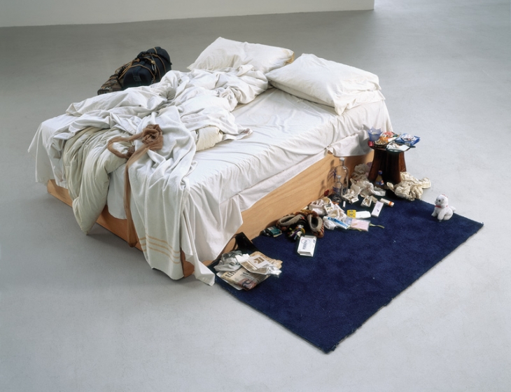
Tracey Emin, My Bed, 1998, Mattress, linens, pillows, objects, 79 x 211 x 234 cm
Tracy Emin created, 'My Bed,' in 1998 and it was exhibited in the Tate in 1998 as one of the shortlisted works for the Turner Prize. It is a view of her bed when she was in a state of suicidal depression. The objects and mess she has around her bed gives the audience a clear insight into her life. Emin's work inspired my print project as it featured the accumulation of rubbish which is then dispersed in the artwork.

My Rubbish Life, Mixed Media Collage on A1 paper, 841 x 594mm.
Subscribe to:
Comments (Atom)